Nowadays, displays offer a rich variety of colors, mostly 32-bit, allowing a multitude of 4,294,967,296 different colors—more than 4 billion! Graphic artists tend to use more and more of these possibilities. Messenger is one of them, especially in version 2009, also known as Wave 3. But if you have a display that allows only 256 colors (8 bit)? Let’s have a try.

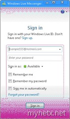
Hrm, nice. You can actually recognize the icon! Let’s sign in.


(Click the images to enlarge them.)
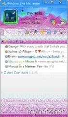
What is that?! You see the normal design, but very many magenta pixels are spread in all dark user interface parts. In the sign-in window, that is not a problem, but looking at the contact list header, you cannot actually read your personal status message properly nor distinguish the toolbar icons. Highlighted items in the contact list are also very hard to read (see “Favorites” in the screenshot).
What about the system notification area? There, the icon is rendered quite fine, and the icon is good enough for you to see your status.
![]()
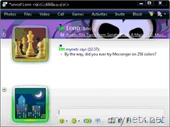
Let’s ask Lonn for his opinion. Lonn is a Senior Product Manager in the Messenger team.

(Click the image to enlarge it.)
Compared with the sign-in window and the contact list, this window is much better to read. I would consider the conversation window to be the only one truly accessible with 8-bit (256) colors. Due to a special resource just for 256 colors, emoticons are also very good to recognize. But look yourself:

(Click the image to enlarge it.)
Summarizing this little experiment, I can say that Windows Live Messenger 2009 is not optimized for low color depths. Most of it is usable, some parts are very hard to read, and some are quite fine. Messenger does not contain any special resources for 256 colors, except for emoticons. Are the 8-bit times really over?

“Are the 8-bit times really over?”
Hope so =)