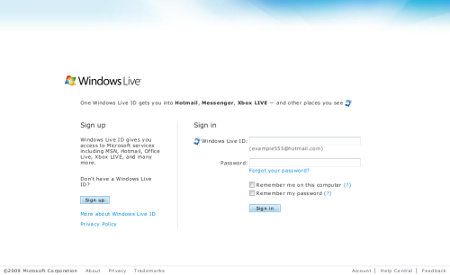
Keeping your Corporate / Site Identity, while using Windows Live Authentication – this has not been possible in the past. The Authentication APIs, namely Web Authentication and Delegated Authentication, do not allow any changing of the Live Sign-in page to adopt your website design and thus a seamless transition while your visitors are redirected to Windows Live and back to your site. Here’s what the standard Windows Live Sign-in looks like:
The legacy way: Relying Partner Suite
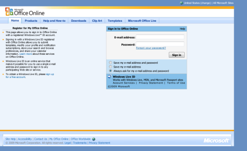
Up to now, the only way of getting a custom Windows Live Sign-in was to sign a contract with Microsoft and become a Relying Partner, which made you able to use Relying Partner Suite (RPS), also known as Windows Live Server API. Here’s a glance at what this looks like:
Soon to come: Live Sign-in UX customization
While Relying Partner Suite has always needed a valid Microsoft Contract for running such customized Sign-in pages in Prod environment (the INT internal and PPE pre-production environments offer RPS testing for free), changing the look of the Web and Delegated Authentications’ Sign-ins has not been possible, as mentioned. This will change, when Windows Live Sign-in and Registration UX Customization becomes available soon.
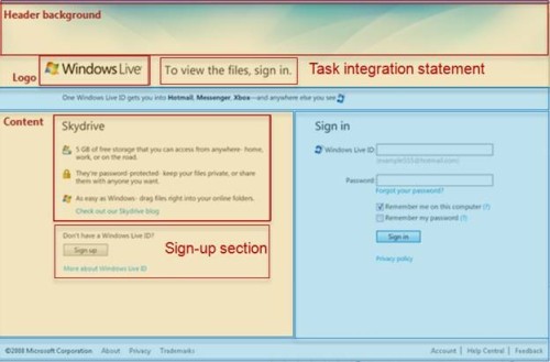
Now have a look at this image:

As you see, the Sign-in page can be spilt into several areas. The sections highlighted in blue, will be themeable, while the yellow areas can be changed completely. Angus Logan, Technical Product Manager for Live Services, announces:
Whilst balancing the need for instant recognition and desire for a consistent experience throughout the entire sign in flow we’ve developed a sign-in and sign-up experience for Windows Live ID which can be co-branded/themed and portions can be customized by web developers.
In the next few weeks a web site owner will be able to self service register their relying party, upload their configuration file and any requests to login.live.com for that Application ID (which redirect to a specific site) will have this co-branding/customization made available.
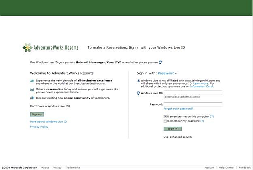
This is what it might look like in the end:

“In the next few weeks,” we read, we can expect these UX customization settings to become available in the Azure Services Developer Portal. However, I found out that they are partially already available for you – if you want to dig around with XML and don’t fear to mess something, have a try and browse the legacy Windows Live Application ID manager at https://msm.live.com/app/ManageCobranding.aspx. “You can customize the sign-in experience of your site while maintaining consistency among all Windows Live ID-enabled sites. To do this, you configure properties in an XML configuration file and upload it.”
Says Angus Logan:
One of the consistent pieces of feedback we got from web sites which let users sign in using Windows Live ID Web Authentication was end users were being jarred by the user-experience shift once they clicked “sign in” and were taken to the Live ID authentication page.
For a security expert it makes perfect sense, only type in your credentials where you sourced them from (and you need to see the address bar). But for an end user you end up wondering “Where did the pretty site go and what am I doing here, was it a mistake?” and never return to the site.
What’s your opinion on this? Are the offered customizations enough, or too less? Or should the Windows Live Sign-in have the same look everywhere?
Source: Live Services Blog, Making the Internet a Safer Place


