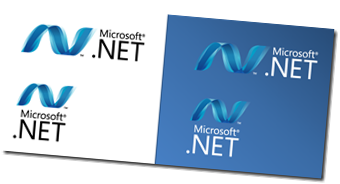
 Forget about the old .NET logo, designed some 8 years ago – there is a new one!
Every two years or so, the Microsoft Professional Developers Conference (PDC) brings out a whole bunch of interesting and new things. While the main focus will be on the Milestone 3 beta of Windows 7 on this year’s PDC 2008 (27-30 October 2008), there are also some other new things to discover.
One of them is the new Microsoft .NET Logo, which was presented to the public yesterday. What did the design team have in mind when creating this logo?
Let’s have a look at the “official” explanation:
We needed a logo that was in sync with the key values that we want .NET to stand for: consistency, robustness and great user experiences. We also wanted a logo that conformed to the design principles that are driving Microsoft’s brand identity evolution and is reflected in newer brands such as Silverlight, Surface and more. Finally, we needed a logo that is more strongly aligned with the portfolio of brands that .NET is most strongly aligned with: Silverlight, Visual Studio and the AppPlat server products.
The result is a design we refer to as the “wave.” The design is strong, simple and distinctive. The suggestion of the letter ‘N’ in the design will become instantly recognizable over time as shorthand for the .NET brand name.
It’s one of many things we’re actively doing to renew our commitment to the future around the overall Rich Platforms we have today.
Finally, I have grabbed a copy of the old logo, for you to compare directly…

