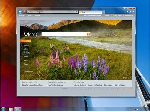
Some 20 days ahead of the public Internet Explorer 9 beta, a first confirmed screenshot of the new user interface has appeared on the Web. Get an insight into what’s new.
The user interface integrates tighter into Windows 7. For example, tabs support jumplists and can dragged off the window. In all areas, I see ideas realized that other browsers use as well. Let’s look at some changes compared to Internet Explorer 8.
- The address bar and search box are combined into one single bar, like Google Chrome does.
- Previously 6 menus are consolidated into one single menu, easy to access.
- The Favorites icon is moving to the top-right edge as well as the home page button.
- To save more room, address bar and tabs now share one line. (I’m sure this can be reverted, in case you are using many tabs and want to give them their deserved space.)
- The new Internet Explorer 9 icon is lighter than its old IE8 equivalent.
- IE9 also supports Web Apps, much the way Google Chrome does. By dragging a Pin icon to the taskbar, you will create an application shortcut – handy for Web Apps like Gmail, Facebook or Remember the Milk that can be used without the full Internet Explorer browser controls.
The screenshot, accidentally published in advance by Microsoft Russia (and already taken down again), was confirmed as real by the news portal Neowin. The public Internet Explorer 9 beta is scheduled for September 15, 2010. The upgraded browser will provide support for the modern web standards HTML5, CSS3 and SVG2, and ships with a new Javascript Engine.
Once again, Internet Explorer is stepping up closer to its competitors, most notably Mozilla Firefox (its 4.0 Beta 4 was just released) and Google Chrome. I’m looking forward to see whether IE9 brings any new features that the others don’t have yet.
What do you think about the new user interface for Internet Explorer 9?


BEAUTIFUL..LIZZ